How to Build a 3D Diorama: Parallax Depth + Crossfading Backgrounds
Turn a flat painted illustration into a room your visitors feel they're standing inside. Two techniques: a mouse-tracked parallax that fakes depth on a single static image, and a click-driven scene cycle that crossfades the entire view to a new background.

The frame above is a working diorama running the exact techniques in this tutorial. Move your mouse over it for parallax depth (gyro tilt on mobile); click Change view to crossfade to the next scene. Total code: ~120 lines.
✍️ The Idea
A painted scene is flat. There is no depth, no camera, no way for a visitor to "lean in." That's fine if the painting is decoration. It's a problem if you want the painting to be a place.
This tutorial covers two layered techniques that, together, make a static illustration feel like an interactive room:
- Parallax depth. The image is scaled up slightly larger than the viewport. As the visitor moves their mouse (or tilts their phone), the image shifts within its overflow margin. The eye reads the offset as parallax, even though nothing has been re-rendered.
- Crossfading scene cycle. Two background image layers stacked in the same position. A single CSS class on the parent toggles which layer is visible. Click a hotspot, the back layer loads a new scene, opacity crossfades over ~0.8 seconds, and the visitor sees the view "change."
Both techniques use only HTML, CSS, and vanilla JavaScript. There's no library, no WebGL, no shader work. The total payload for the diorama logic is under 4 KB of gzipped JS.
Prerequisites
- One hero image: a painted or photographed scene at roughly 2000×1100 to 3000×1700, exported as WebP or compressed JPEG. Aspect ratio doesn't have to be exact, just consistent across scenes.
- Optionally, a small set of alternate scenes (3 to 15) sharing the same camera composition, so only the background differs. AI image models can produce these with a prompt that locks the foreground and varies only the background.
- A static web host. No server-side anything required.
- About 90 minutes for first build; 15 minutes for each additional scene after that.
End Result
A single full-screen page that:
- Renders a painting that shifts subtly with mouse position (desktop) or device tilt (mobile)
- Has clickable hotspots pinned to features in the image (a record player, a window, whatever)
- Cycles the background through a rotation of alternate scenes on click, crossfading smoothly
- Keeps the hotspots anchored to image features even when scenes have slightly different aspect ratios
If you want to see a working version, the Dariah's Apartment demo on this site is built with exactly the technique below: an apartment painting with a mouse-driven parallax and a window button that cycles through 12 different views from the same camera.
What "same camera, different scenes" looks like:
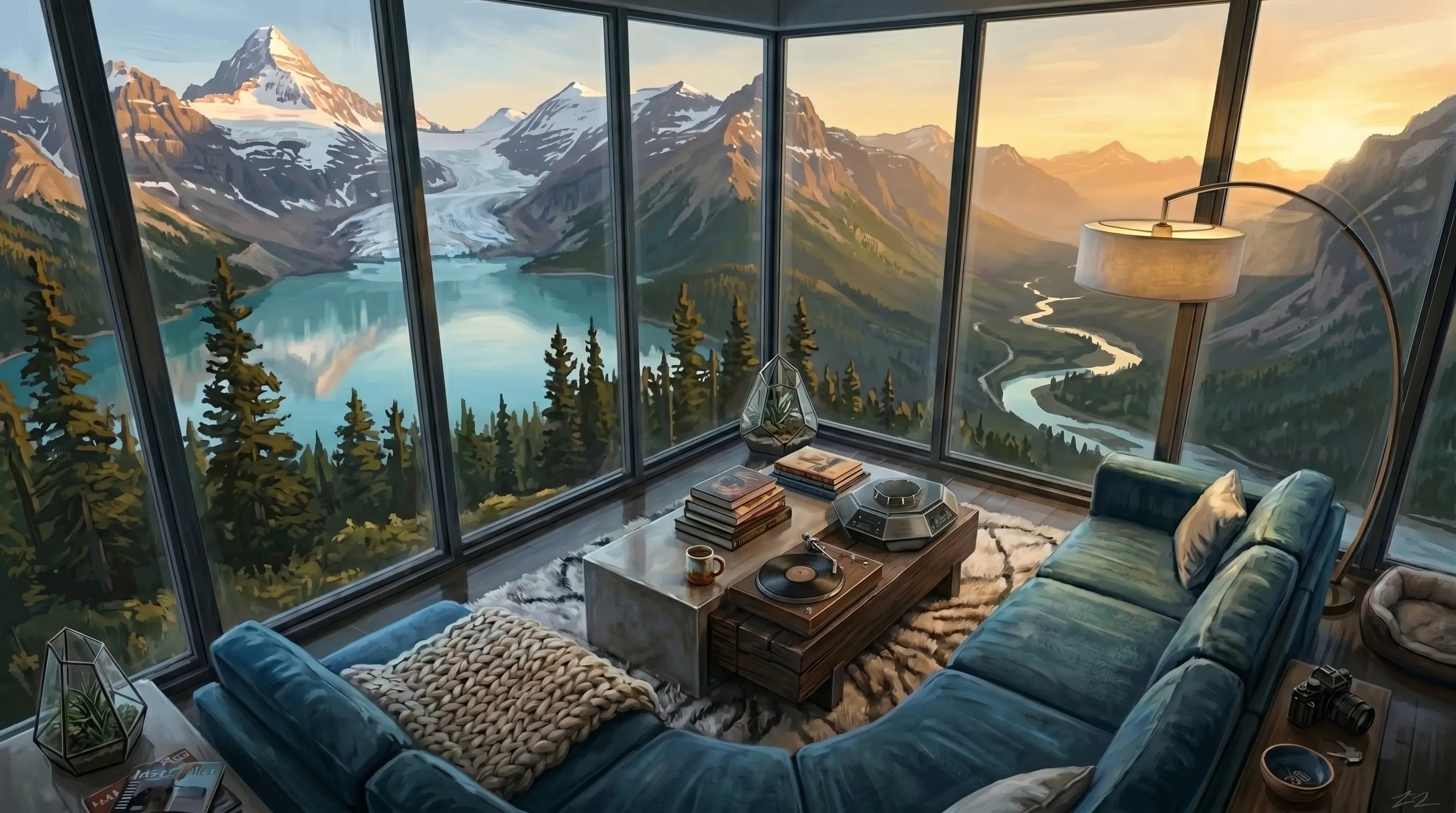
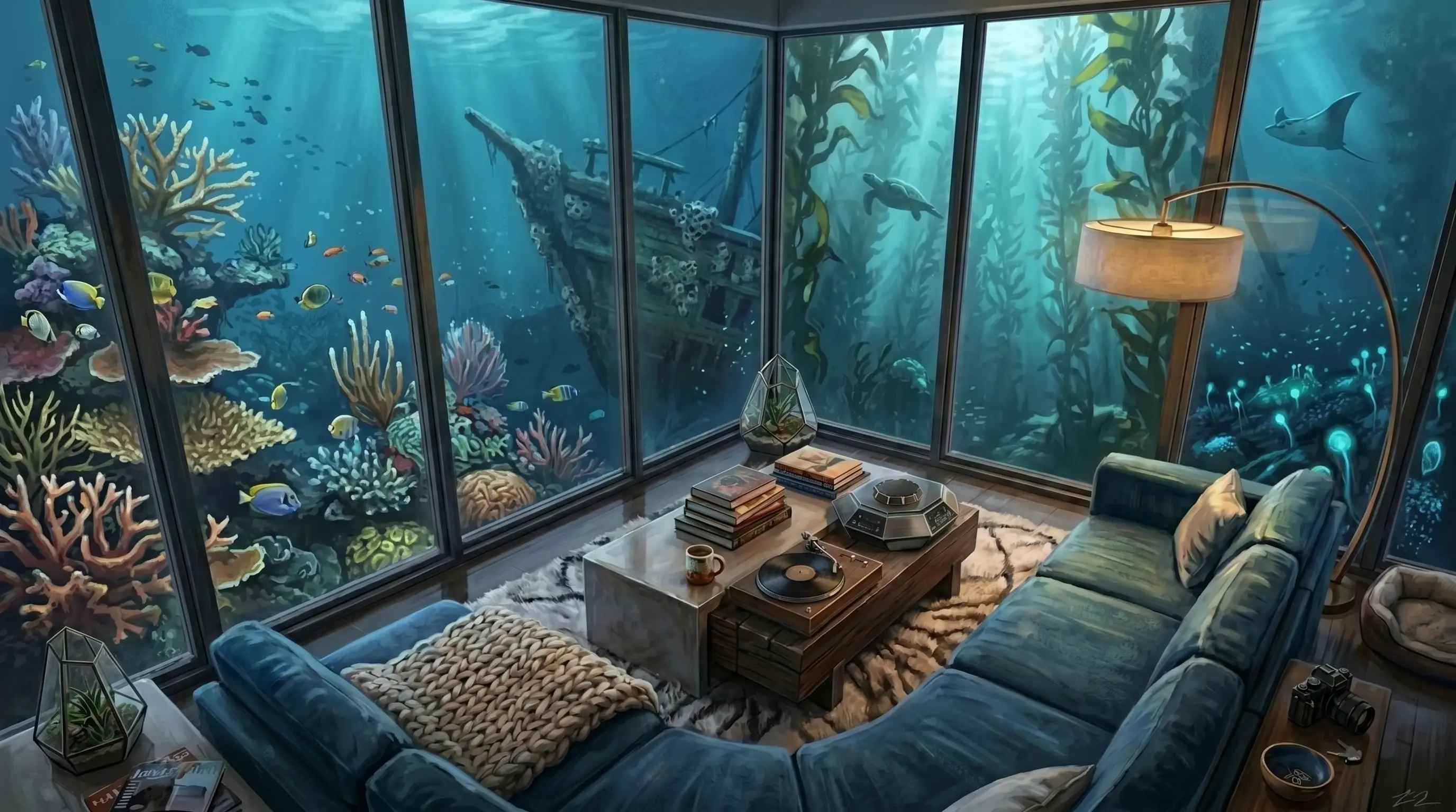
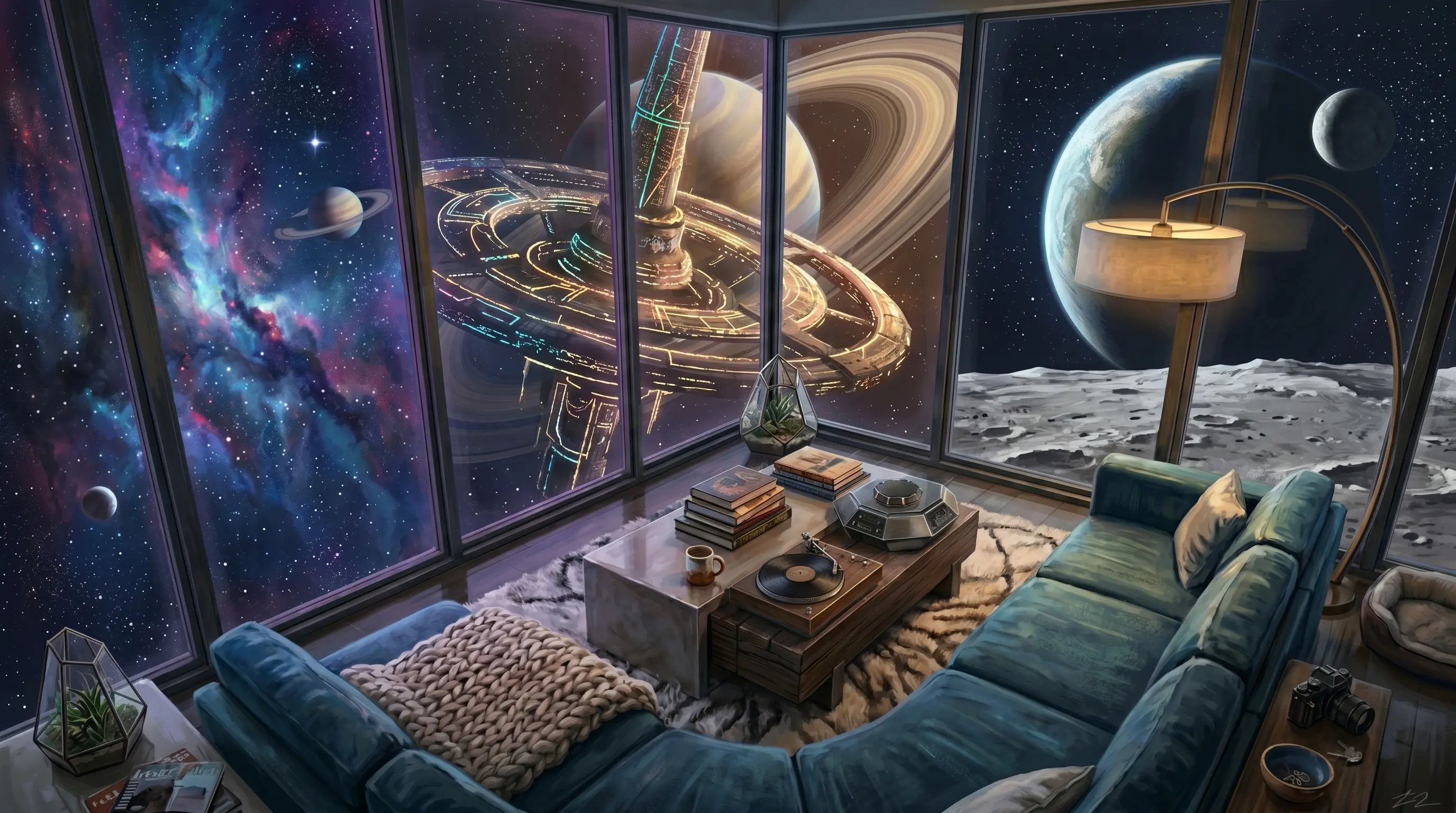
Four of the alternates from the live demo. Foreground composition (the apartment, the lamp, the rug, the windows) is identical across every scene. Only the view through the glass changes. This consistency is what makes the crossfade feel like a single room changing its outside world rather than two unrelated images dissolving into each other.
1 The Scaled Stage
Everything sits inside a fixed-position .stage wrapper that fills the viewport. Inside the stage, the painting itself is set to object-fit: cover on a slightly scaled-up transform so there's room to shift it without exposing edges.
The scale factor matters. Pick the maximum offset distance you want for parallax (say, 60 px) and back-calculate: if you'll translate up to 60px on a 1920 px viewport, you need at least scale(1 + 60/1920) = scale(1.031) headroom. In practice scale 1.20 to 1.25 gives a comfortable margin and a more dramatic parallax range.
<div class="stage-fixed">
  <div class="stage" id="stage">
    <!-- Painting goes here -->
    <img class="scene-img a" id="scene-img"
         src="hero-scene.webp" alt="">
  </div>
</div>
html, body { margin:0; padding:0; height:100%; overflow:hidden; background:#0a0612; }

/* Fixed wrapper pins the stage to the viewport so it never scrolls. */
.stage-fixed {
  position: fixed; inset: 0;
  overflow: hidden;
}

/* The stage holds the painting and any hotspots. It's the element
   we transform on every parallax frame. */
.stage {
  position: absolute; inset: 0;
  transform: translate3d(
    calc(var(--px, 0) * -55px),
    calc(var(--py, 0) * -42px),
    0
  ) scale(1.22);
  transform-origin: center center;
  will-change: transform;
}

.scene-img {
  position: absolute; inset: 0;
  width: 100%; height: 100%;
  object-fit: cover;
  object-position: center center;
  pointer-events: none;
  user-select: none;
}
--px and --py are CSS custom properties we'll set from JavaScript in step 4. They range from -1 to 1. Multiplying by -55px and -42px means the painting can shift up to 55 px horizontally and 42 px vertically. The negative sign makes the painting move against the cursor, which reads as the camera following the cursor.
translate3d instead of translate? The 3D variant promotes the element to its own compositor layer in WebKit and Blink, which means the parallax animation runs entirely on the GPU. You'll see a measurable framerate difference on lower-end Android.
2 Layered Backgrounds
To crossfade between scenes, you need two image elements stacked in the same position. One is visible at any moment; the other is the "back buffer" that loads the next scene in advance.
<img class="scene-img a" id="scene-img"   src="hero-scene.webp" alt="">
<img class="scene-img b" id="scene-img-b" alt="" aria-hidden="true">
.scene-img { transition: opacity 0.8s ease; }
.scene-img.b { opacity: 0; }

/* Toggle .scene-swap on the parent .stage to flip which layer is on top. */
.stage.scene-swap .scene-img.a { opacity: 0; }
.stage.scene-swap .scene-img.b { opacity: 1; }
This is the entire crossfade primitive. Default state: A is opaque, B is transparent. Add the .scene-swap class to .stage and the opacities flip over 800 ms. Remove the class to swap back. We'll wire the actual cycle logic in step 5.
3 The Parallax CSS Math
The transform expression in step 1 looks straightforward, but a few subtle decisions are baked in.
Why CSS variables, not direct transform updates?
Writing element.style.transform = '...' from JavaScript on every frame causes the browser to reparse the entire transform string and rebuild the matrix. Setting CSS custom properties (document.body.style.setProperty('--px', value)) lets the rendering engine keep the parsed transform and just substitute one number. On a heavy page this is the difference between 60 fps and 35 fps.
Why translate first, then scale?
Transform functions apply right-to-left. translate(...) scale(1.22) means: first scale the element up 22%, then translate that scaled element. If you reversed the order, the translation amounts would be evaluated in the original (pre-scale) coordinate space and the parallax would feel too small on large viewports.
The asymmetric horizontal/vertical offsets
In the example we use -55px horizontal and -42px vertical. Eyes are wider than they are tall, and most paintings have more horizontal information than vertical. A roughly 4:3 ratio between the parallax offsets feels natural. If you go 1:1 the vertical parallax will dominate and feel uncomfortable.
4 Drive the Parallax (Mouse, Gyro, Touch)
Three input sources feed the same --px / --py CSS variables, with a damped lerp so motion is buttery instead of jittery.
// Smooth lerp from the latest target into the live --px/--py vars.
var pxRaf = null, current = { x:0, y:0 }, target = { x:0, y:0 };

function setTarget(x, y) {
  target.x = Math.max(-1, Math.min(1, x));
  target.y = Math.max(-1, Math.min(1, y));
  if (pxRaf) return;
  pxRaf = requestAnimationFrame(commit);
}
function commit() {
  current.x += (target.x - current.x) * 0.18;
  current.y += (target.y - current.y) * 0.18;
  document.body.style.setProperty("--px", current.x.toFixed(3));
  document.body.style.setProperty("--py", current.y.toFixed(3));
  if (Math.abs(target.x - current.x) > 0.001 ||
      Math.abs(target.y - current.y) > 0.001) {
    pxRaf = requestAnimationFrame(commit);
  } else {
    pxRaf = null;
  }
}

// --- Source A: mouse position (desktop) ---
window.addEventListener("pointermove", function (e) {
  if (e.pointerType === "touch") return;
  setTarget(((e.clientX / window.innerWidth) - 0.5) * 2,
            ((e.clientY / window.innerHeight) - 0.5) * 2);
}, { passive:true });

// --- Source B: device gyro (mobile) ---
var tiltOrigin = null;
function onOrient(e) {
  if (e.beta == null || e.gamma == null) return;
  if (tiltOrigin === null) tiltOrigin = { beta:e.beta, gamma:e.gamma };
  setTarget((e.gamma - tiltOrigin.gamma) / 25,
            (e.beta  - tiltOrigin.beta)  / 25);
}
function startOrientation() {
  window.addEventListener("deviceorientation", onOrient, { passive:true });
}

// iOS 13+ requires a user-gesture permission grant for the gyro.
// Non-iOS browsers just start listening immediately.
var needsIOSPerm = (typeof DeviceOrientationEvent !== "undefined") &&
                   (typeof DeviceOrientationEvent.requestPermission === "function");
if (!needsIOSPerm && typeof DeviceOrientationEvent !== "undefined") {
  startOrientation();
}
if (needsIOSPerm) {
  var asked = false;
  function unlock() {
    if (asked) return; asked = true;
    DeviceOrientationEvent.requestPermission()
      .then(function (s) { if (s === "granted") startOrientation(); })
      .catch(function(){});
  }
  document.body.addEventListener("touchend", unlock, { once:true, passive:true });
  document.body.addEventListener("click",    unlock, { once:true });
}

// --- Source C: touch-drag fallback ---
// If we never got gyro permission (or the device has no gyro at all),
// a single-finger drag on the screen pans the parallax instead.
var touchStart = null;
window.addEventListener("touchstart", function (e) {
  if (tiltOrigin !== null) return;
  if (e.touches.length !== 1) return;
  touchStart = { x:e.touches[0].clientX, y:e.touches[0].clientY,
                 tx:target.x, ty:target.y };
}, { passive:true });
window.addEventListener("touchmove", function (e) {
  if (tiltOrigin !== null) return;
  if (!touchStart || e.touches.length !== 1) return;
  setTarget(
    touchStart.tx + (e.touches[0].clientX - touchStart.x) / window.innerWidth  * 2,
    touchStart.ty + (e.touches[0].clientY - touchStart.y) / window.innerHeight * 2
  );
}, { passive:true });
Why three input sources?
Each handles a case the others miss. Mouse alone leaves mobile users with a static page. Gyro alone leaves desktop users static and is silently denied on iOS until they grant permission. Touch-drag is the universal fallback so iPad users who declined the gyro permission still get the depth effect when they drag a finger across the screen. The handlers all short-circuit if a higher-priority source is active, so you never get fight-y inputs.
5 The Scene Cycle (Crossfade with Load Detection)
The cycle is a small state machine on top of the A/B layered images from step 2. The tricky parts are: loading the new image before fading, handling the case where the browser already has the image cached (and the load event would never fire), and keeping the lerp pointers correct after the swap.
// Your list of background images. Index 0 is the one already in the //at page load, so the cycle starts at 1 and loops back to 0. var SCENES = [ "hero-scene.webp", "/scenes/alt-1.webp", "/scenes/alt-2.webp", "/scenes/alt-3.webp", ]; var stage = document.getElementById("stage"); var sceneA = document.getElementById("scene-img"); var sceneB = document.getElementById("scene-img-b"); var scene_idx = 0; var animating = false; var FADE_MS = 800; function nextScene() { if (animating) return; animating = true; scene_idx = (scene_idx + 1) % SCENES.length; var src = SCENES[scene_idx]; function doSwap() { stage.classList.add("scene-swap"); setTimeout(function () { // Bake the new image into A so we can drop the swap class // without a visible jump. Then B is ready for the next click. sceneA.src = sceneB.src; requestAnimationFrame(function () { stage.classList.remove("scene-swap"); animating = false; }); }, FADE_MS); } function onLoadOnce() { sceneB.removeEventListener("load", onLoadOnce); sceneB.removeEventListener("error", onErrorOnce); doSwap(); } function onErrorOnce() { sceneB.removeEventListener("load", onLoadOnce); sceneB.removeEventListener("error", onErrorOnce); animating = false; } sceneB.addEventListener("load", onLoadOnce); sceneB.addEventListener("error", onErrorOnce); // Same-src or already-cached cases never fire 'load'. Fall through // to the swap manually so the cycle doesn't get stuck. var absoluteSrc = new URL(src, document.baseURI).href; if (sceneB.src === absoluteSrc && sceneB.complete && sceneB.naturalWidth > 0) { sceneB.removeEventListener("load", onLoadOnce); sceneB.removeEventListener("error", onErrorOnce); doSwap(); return; } sceneB.src = src; if (sceneB.complete && sceneB.naturalWidth > 0) { sceneB.removeEventListener("load", onLoadOnce); sceneB.removeEventListener("error", onErrorOnce); doSwap(); } } // Wire to whatever click target makes sense for your scene. document.getElementById("my-cycle-button") .addEventListener("click", function () { nextScene(); });
animating latch. Without it, rapid clicks during the 800 ms fade would queue up multiple loads and your scenes would skip forward two or three at a time. The latch ensures one click maps to one transition.
A wider sample of scenes from the same camera:
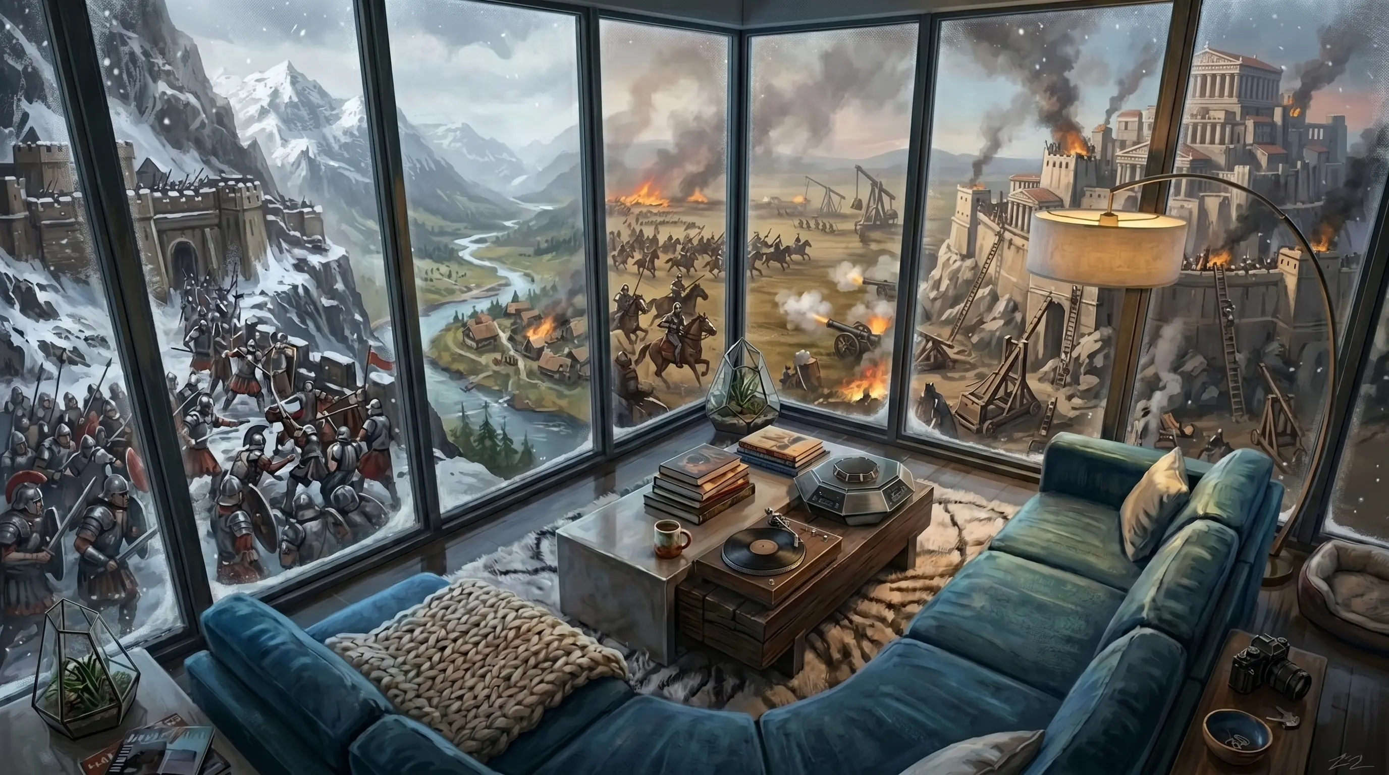
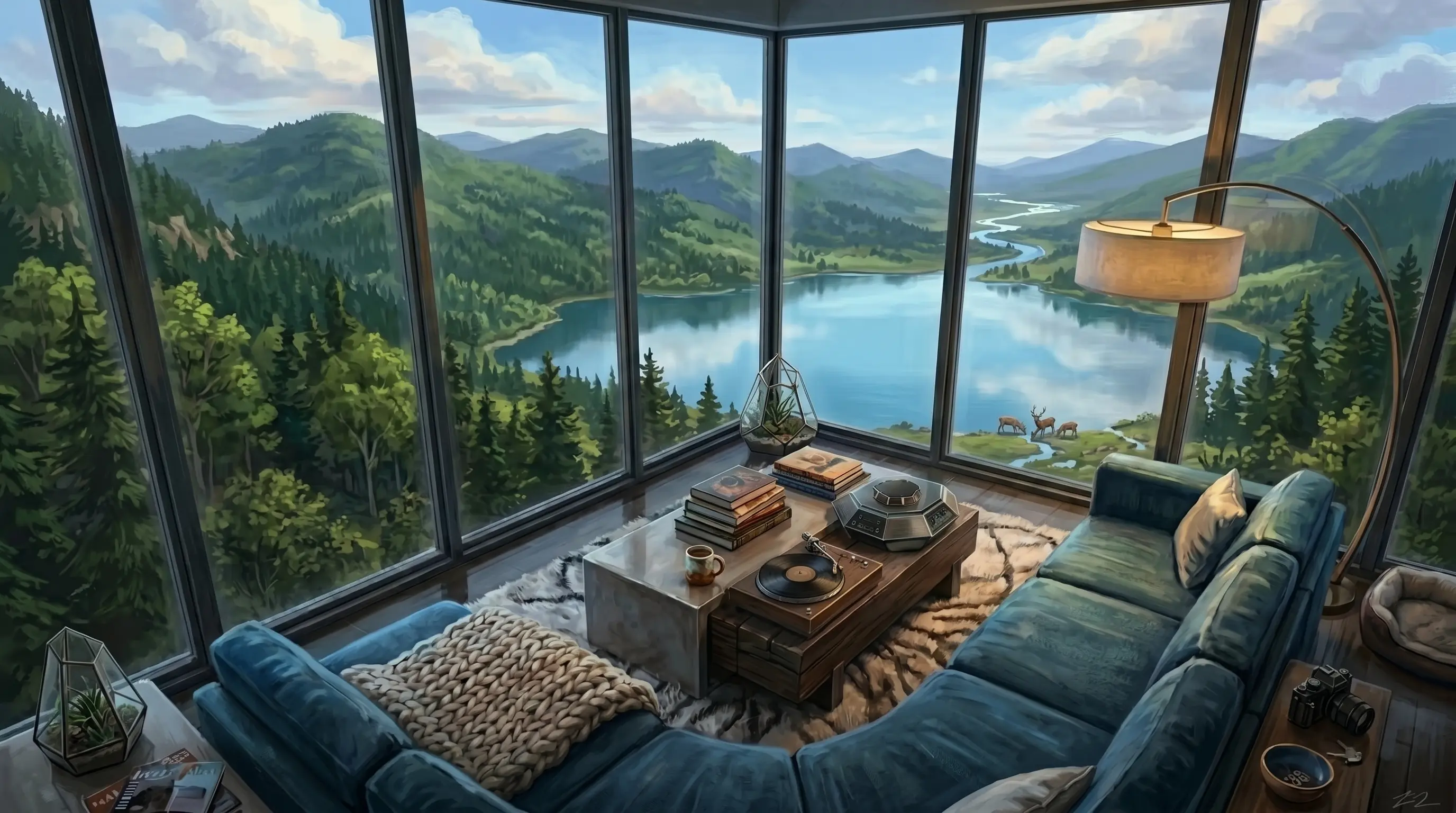
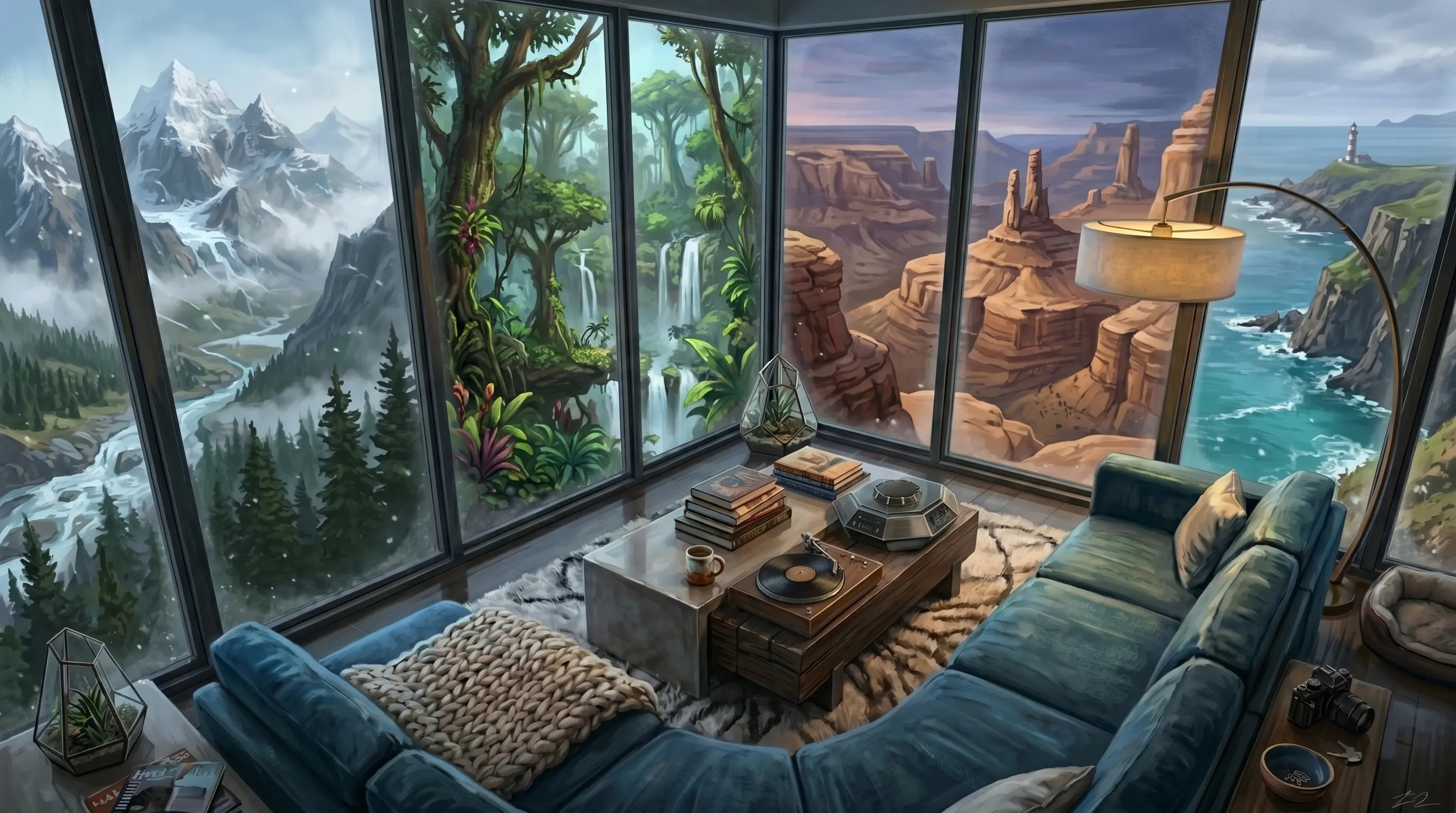
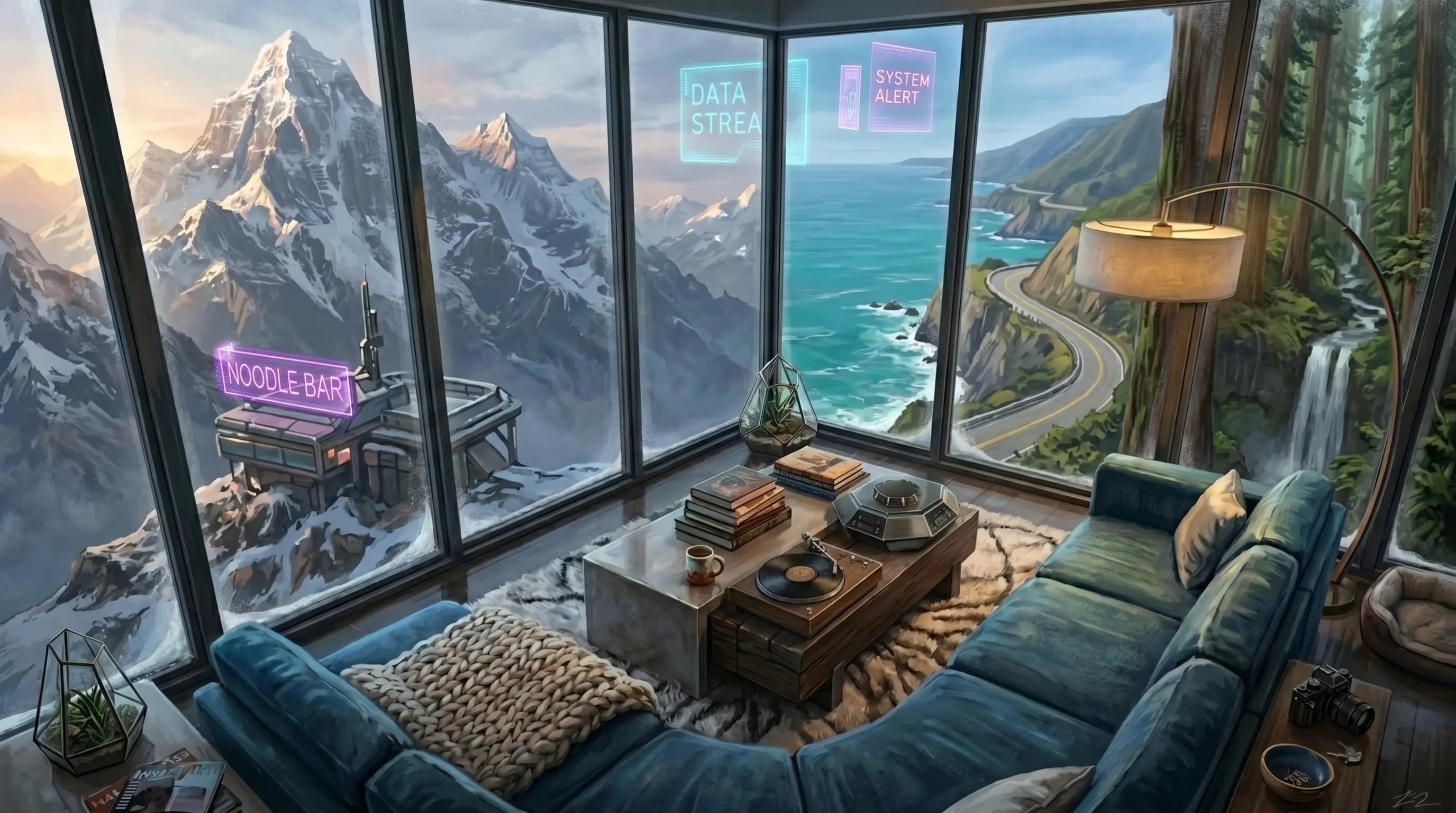
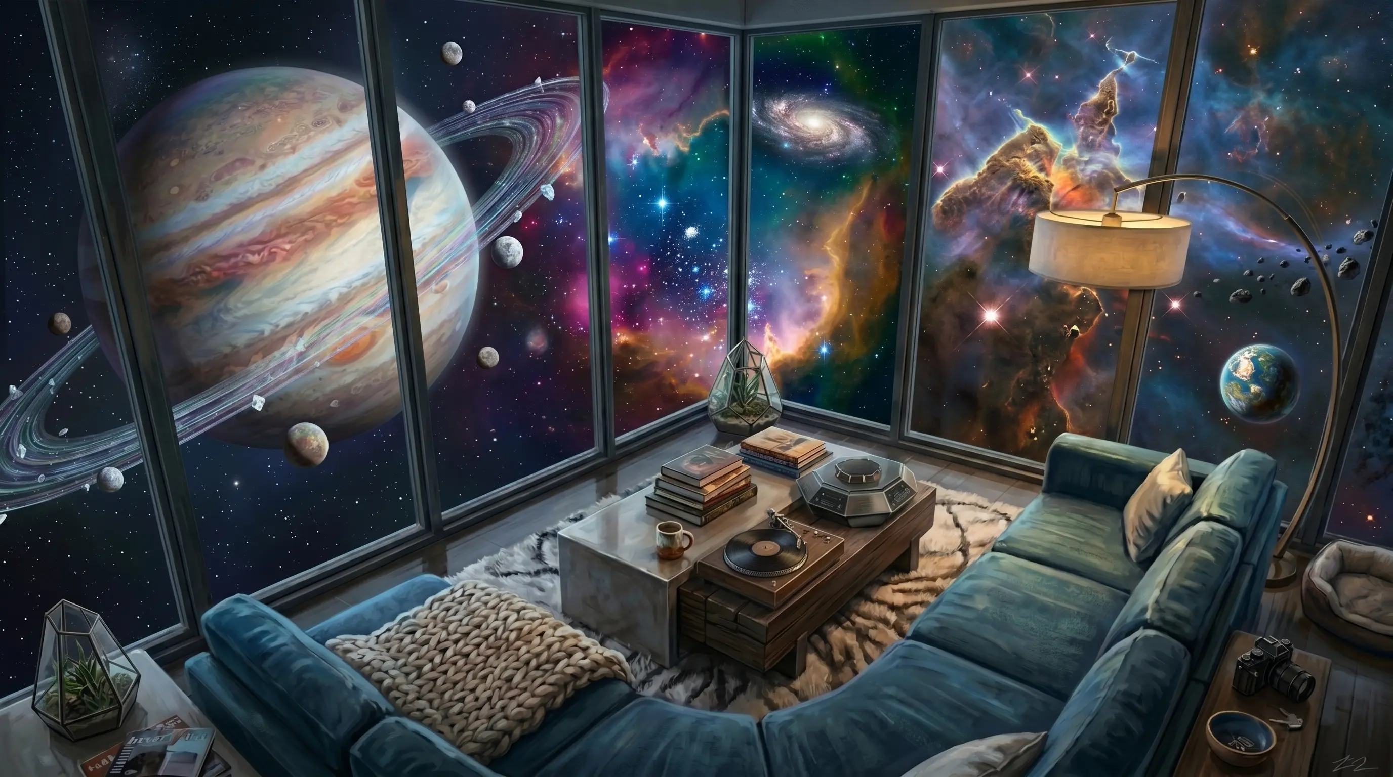
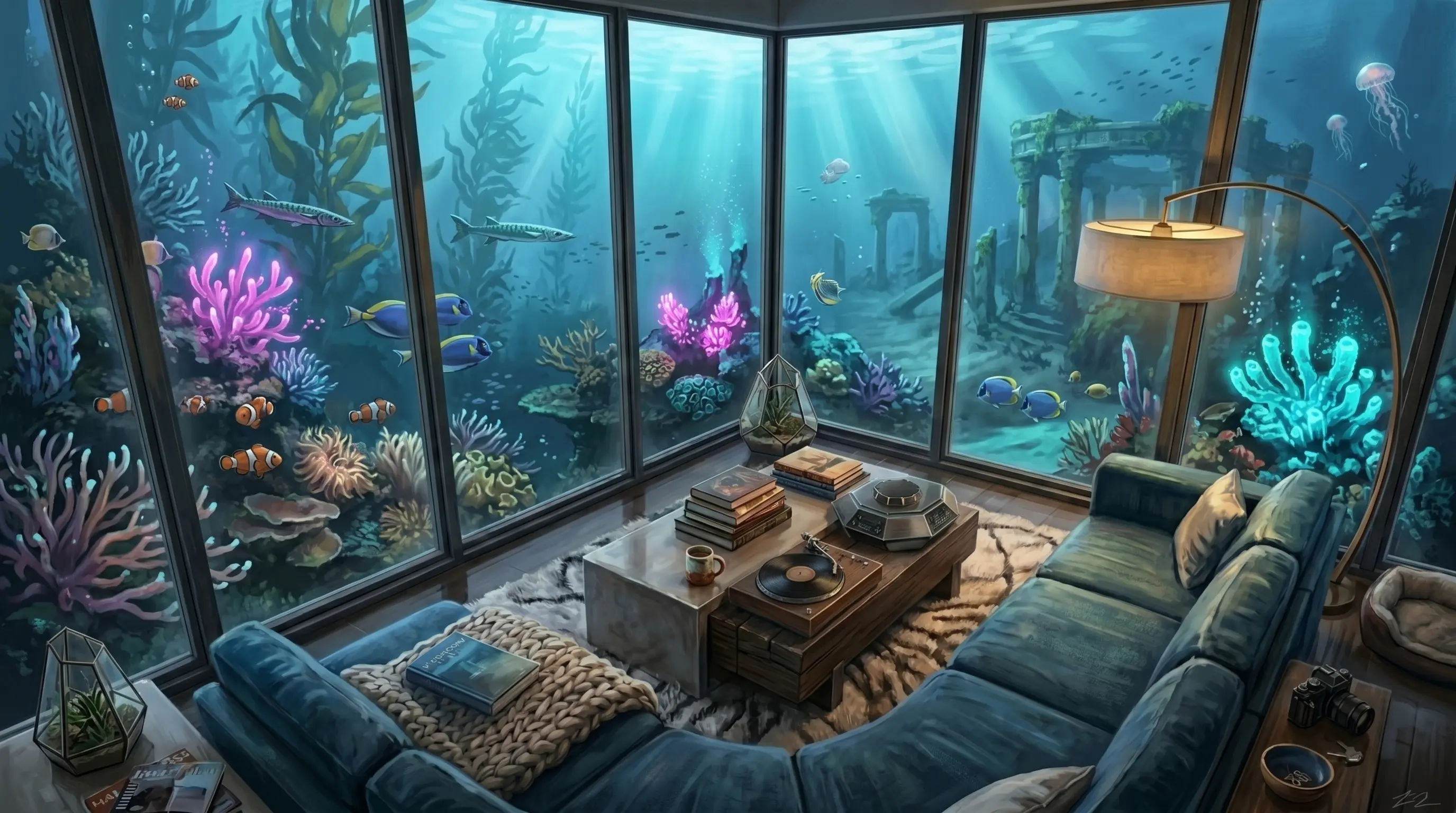
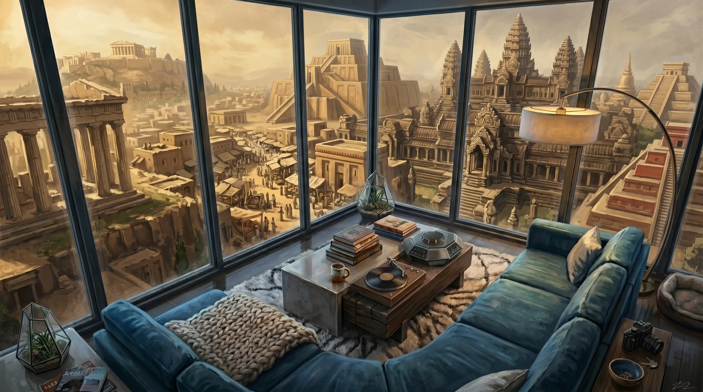
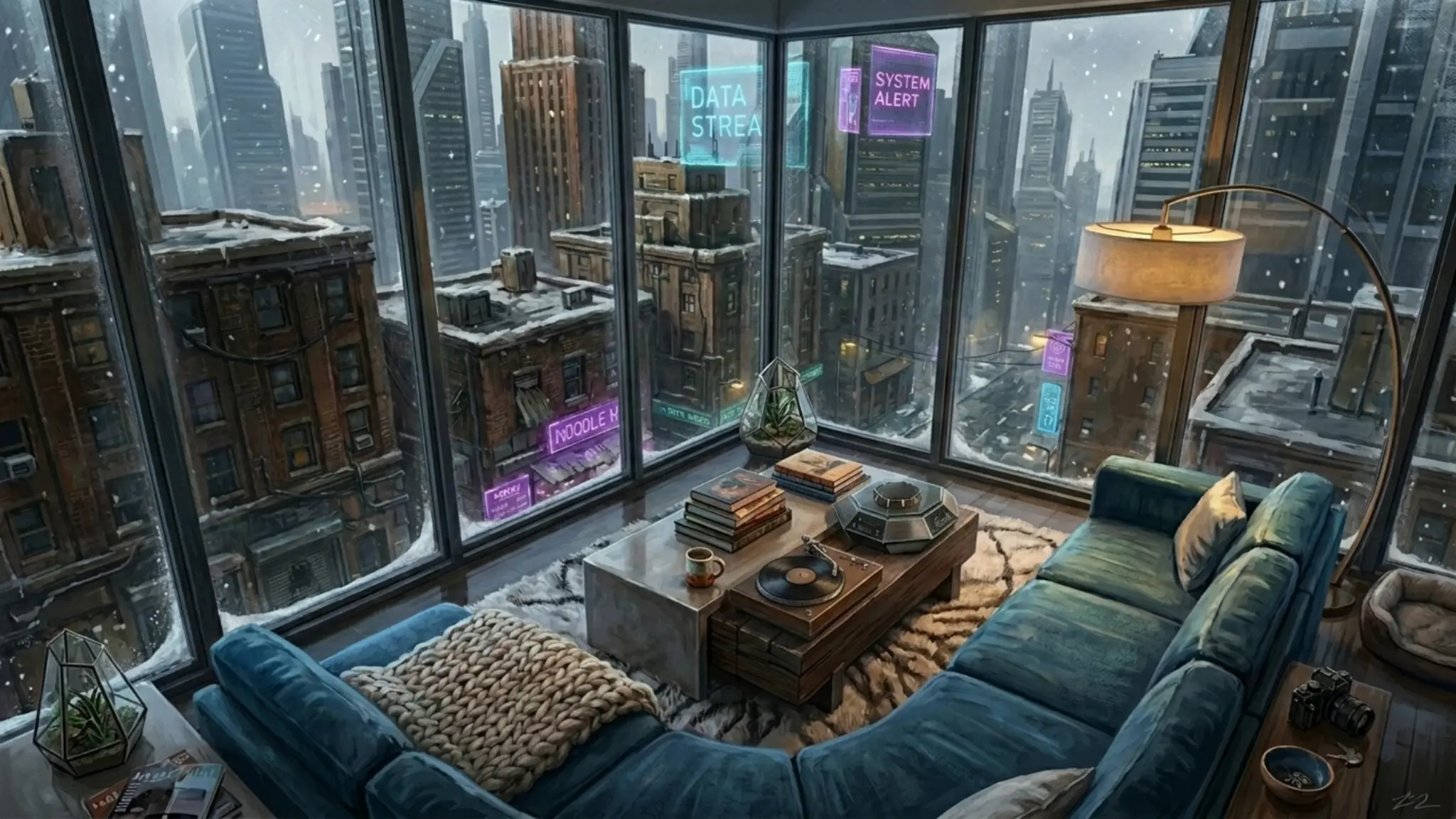
Eight more scenes from the rotation. AI image models do this kind of variation well: prompt the foreground room once, lock that composition, then vary only the prompt's outside-world clause. Every image you generate this way can become a frame in the cycle.
Hotspots that survive aspect-ratio changes
If your alternate scenes don't all share the exact same dimensions, your hotspot positions (computed as percentages of the image rect) can drift. After every swap, re-read the loaded image's naturalWidth / naturalHeight and recompute the cover rect that hotspot positions are pinned to:
if (sceneA.naturalWidth && sceneA.naturalHeight) {
  IMG_W = sceneA.naturalWidth;
  IMG_H = sceneA.naturalHeight;
  layoutAll();  // your function that repositions hotspots
}
6 Deploy
The diorama page is a single self-contained HTML file. Drop it on any static host. A few production checks:
- Image formats. WebP at quality 82-86 typically beats JPEG by 30-50% at indistinguishable quality. AVIF is smaller still but slower to decode on lower-end Android, which interacts badly with the parallax requestAnimationFrame loop. WebP is the safe pick.
- Preload the first alternate scene. Add
<link rel="preload" as="image" href="/scenes/alt-1.webp">in the<head>so the first click feels instant. - CDN cache. Backgrounds are large; serve them with
Cache-Control: public, max-age=31536000, immutableso the second visit doesn't re-download. - Reduced motion. Add a
@media (prefers-reduced-motion: reduce)rule that disables the parallax transform and the scene-swap transition. Users with vestibular issues will thank you.
@media (prefers-reduced-motion: reduce) {
  .stage     { transition: none !important; transform: scale(1.22) !important; }
  .scene-img { transition: none !important; }
}
How It Works (Reference)
- Parallax loop. Input handlers (pointermove / deviceorientation / touchmove) all funnel into a single
setTarget(x, y)function. Each call sets a target in -1..1 range and starts a requestAnimationFrame loop if one isn't already running. The loop lerpscurrenttowardtargetwith a factor of 0.18 per frame and writes the result into CSS custom properties ondocument.body. The CSS engine then transforms the.stageon the next paint without any extra JS work. - Scene crossfade. A and B are stacked img elements with a CSS opacity transition. Click handler increments an index, loads the new src into B, waits for the load event (or detects cached/same-src cases manually), adds
.scene-swapto the parent to flip opacities, waits the fade duration, then copies B's src into A and removes the swap class so B is ready to load the next scene. - Hotspot anchoring. Each hotspot is positioned in JS using percentages of the displayed image rect (which is itself computed from the natural dimensions, viewport, and
object-fit: covermath). On window resize or scene swap, the layout function recomputes every hotspot position. Because hotspots are inside.stage, the parallax transform automatically applies to them too, so they ride with the painting they're pinned to.
Troubleshooting
Parallax feels jittery, not smooth
Three usual causes. (1) You're updating element.style.transform directly instead of CSS variables. Switch to the custom-property approach. (2) The scaled image is too small and the browser is upscaling pixels every frame. Use a source image at 1.5× to 2× the viewport size so it's downscaled, not upscaled. (3) You're missing will-change: transform on .stage and the compositor isn't promoting the layer.
iOS gyro never activates
iOS 13+ requires DeviceOrientationEvent.requestPermission() and that call must happen inside a user-gesture handler (touch or click). If you call it on page load, iOS silently denies. The step-4 code listens for touchend / click and unlocks on the first such event. Tap once anywhere on the page and the gyro starts working.
First click on the cycle button does nothing
The browser cached image B's src at the same URL it already has, so the load event won't fire and the animating flag stays true forever. The same-src and cached-image checks at the end of nextScene() handle this; make sure you didn't skip them.
Crossfade flashes briefly to the old image at the end
You're removing the .scene-swap class before A has actually painted the new src. The requestAnimationFrame wrapper in doSwap ensures A renders its new src for one frame before the swap class drops. Make sure you have that rAF and aren't removing the class synchronously.
Hotspots drift when I swap to a scene with different dimensions
You're not updating the IMG_W / IMG_H constants used by the cover-rect math after the swap. Add the naturalWidth / naturalHeight read shown in step 5 and call your layout function. Hotspots will reposition correctly.
See it live: an example diorama built with this exact technique. Browse the other tutorials or jump back to the main site.